Company Branding
Pigeon
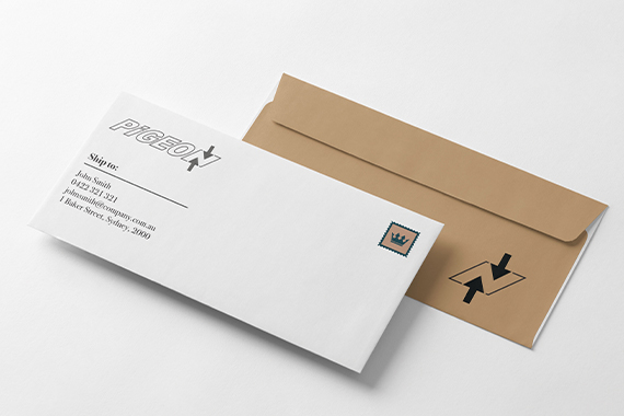
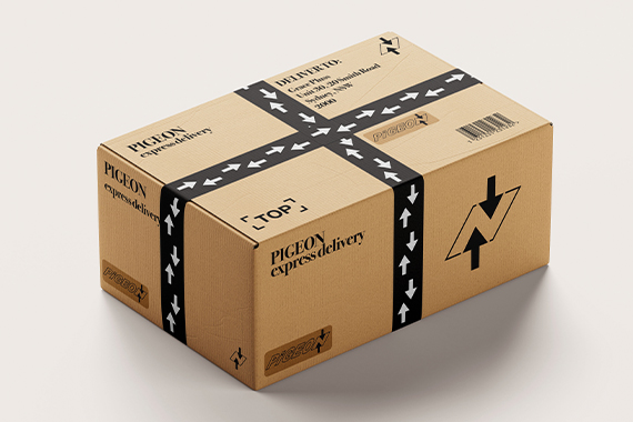
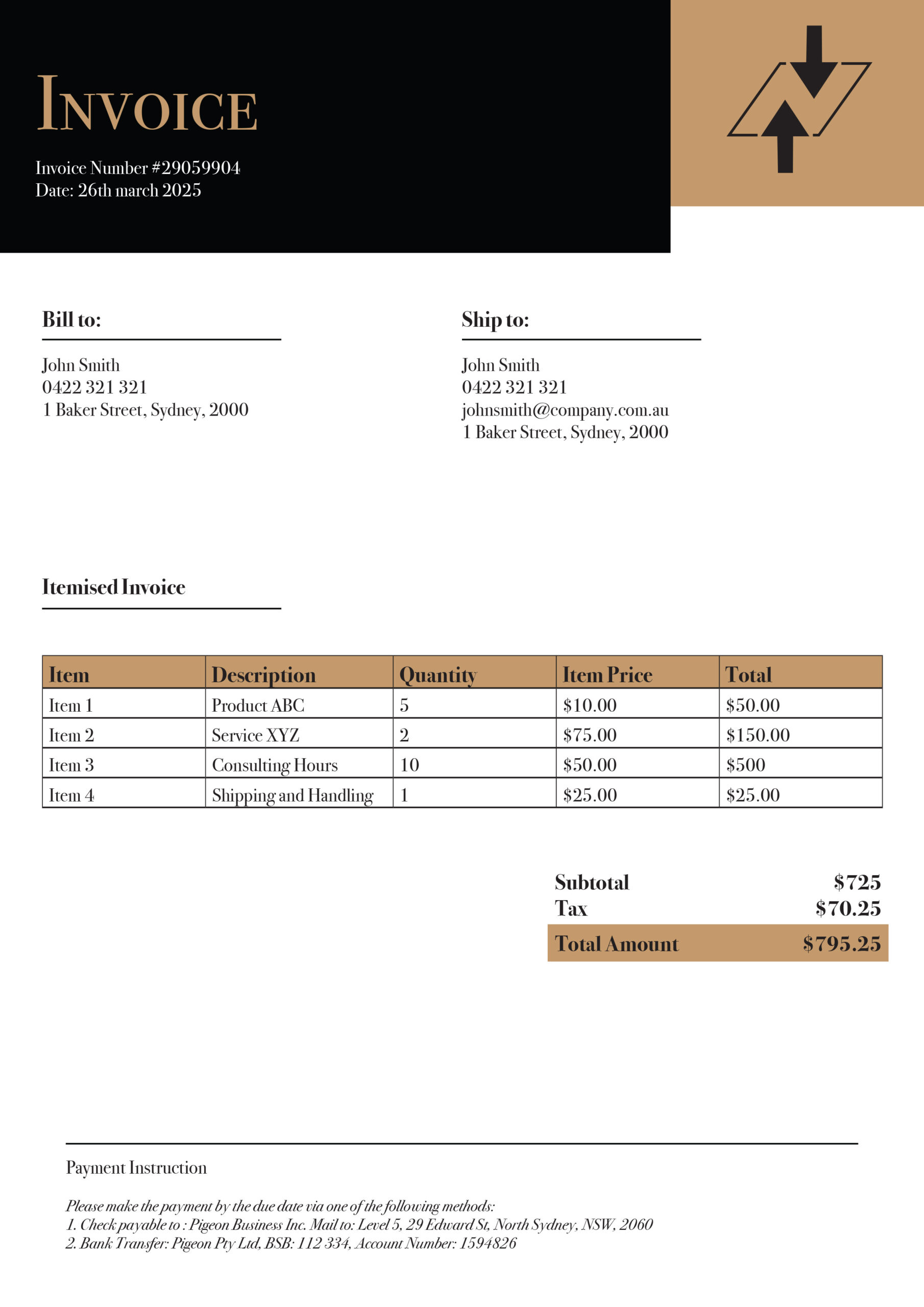
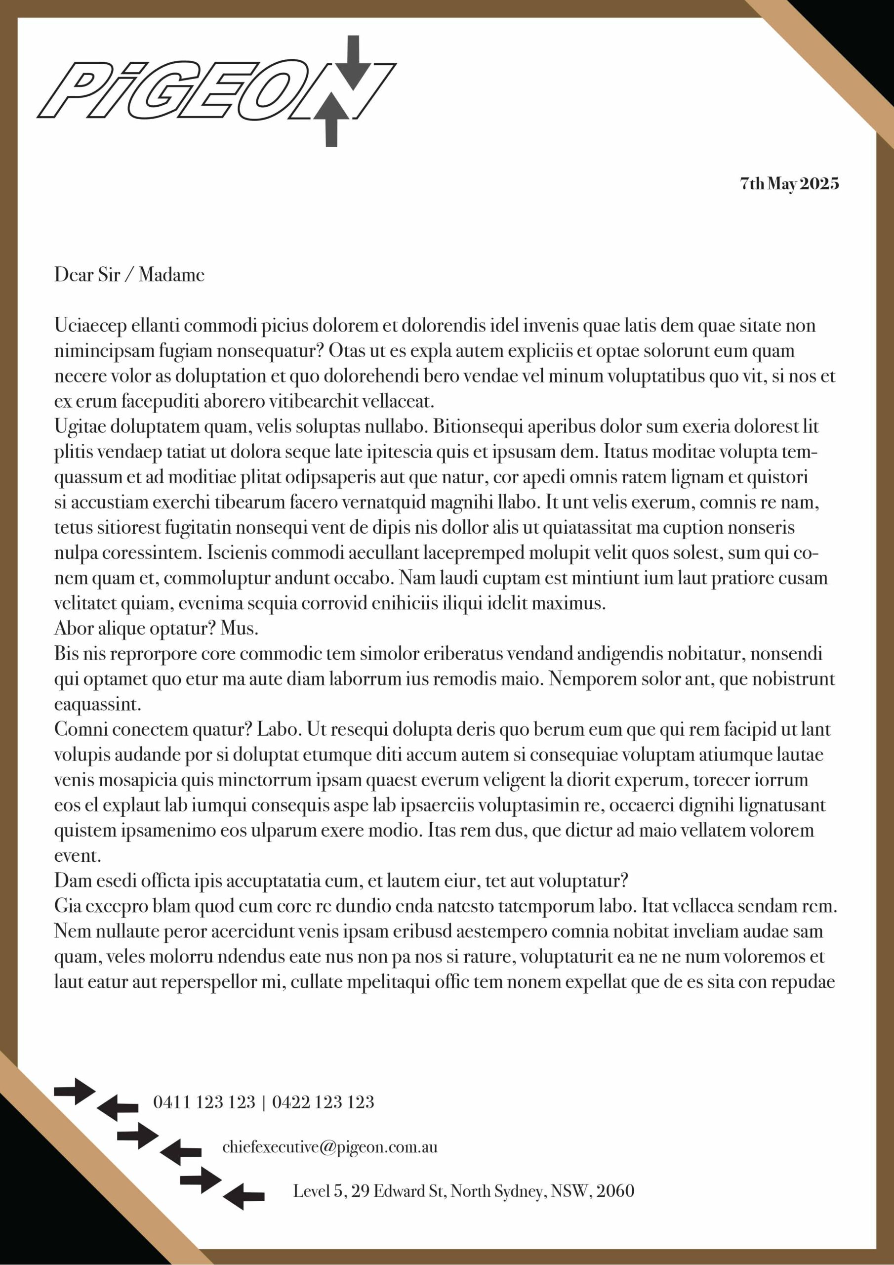
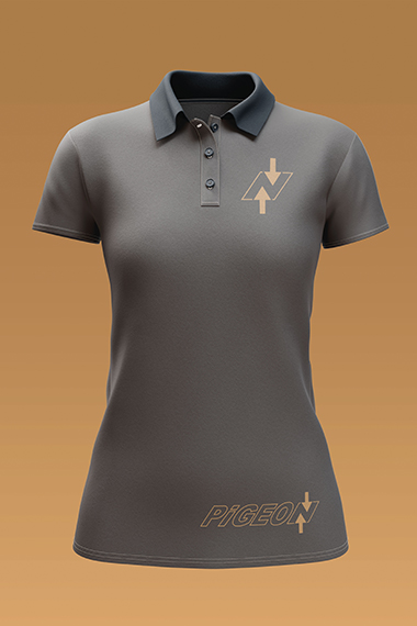
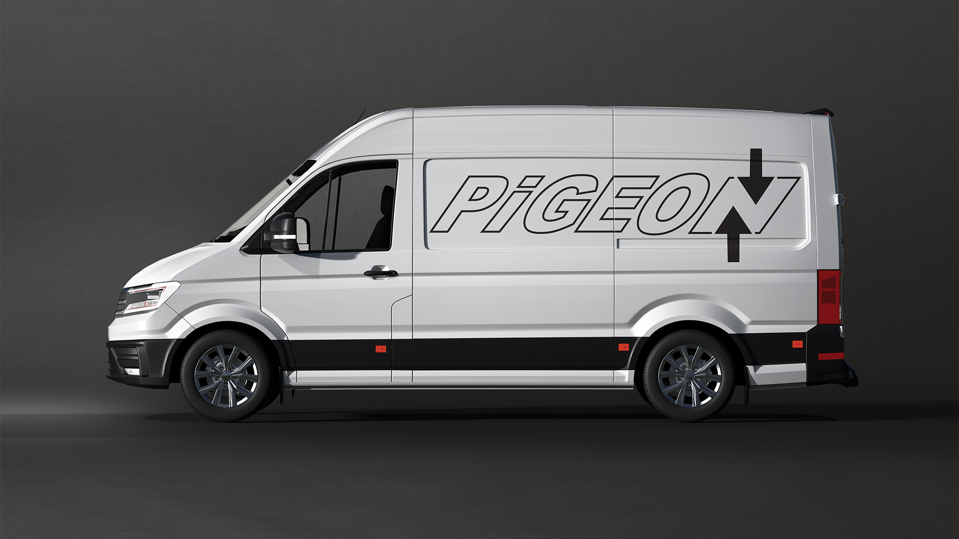
I wanted to design a brand aimed at an upper-class market, so I chose a clean, sophisticated beige palette. I believe that overly bright colours can sometimes feel loud or tacky if not used thoughtfully, so I leaned into simplicity and elegance.
The subtle italics in the typography add refinement to the logo, while the two arrows forming the letter “N” subtly reference movement and delivery.
